18Jul


Okay, so Mick Jagger encouraged us to do just that but let's ignore him for now and consider all the other infamous musicians who took the more colourful route. Prince sang about 'Purple Rain, Mick Hucknell about 'Red, Red Wine' and of course, yellow features everywhere in songs by The Beatles, Elton John and Coldplay. Blue is ever present too - Elvis's 'Blue Suede Shoes', Bowie's 'Blue Jean' to name just a couple. But now ask yourself, why is colour so omnipresent in this musical world?


Take the colour blue for instance. In songwriting, "blue" is a dynamic emotional chameleon. It can evoke profound melancholy and heartbreak, signify calming serenity and stability, or even stand for uplifting joy and optimism. This duality allows artists to shape mood depending on context.


In classic blues and jazz, the word—and the use of "blue notes" (bent or flattened pitches)—is used to capture sorrow, hard times, and emotional struggles. .When artists sing about a "blue state of mind" or a "blue period" (inspired by Picasso's art), they are leaning into a universally understood shorthand for profound loneliness, grief, and emotional vulnerability. For example Joni Mitchell’s seminal 1971 album Blue uses the word to personify loss, substance abuse, and the painful unravelling of romance.
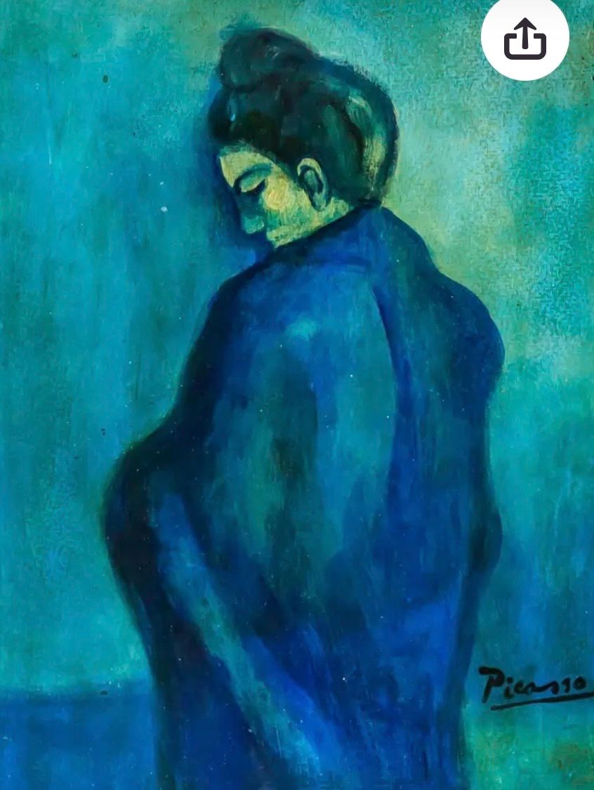
                                 Picasso's "Woman In Blue"


In colour theory, blue is heavily associated with the sky and ocean, communicating tranquility, order, and inner peace.  Songwriters use this brighter side of blue to contrast dark periods, offering a sense of stability, relief, or the calm that follows heartbreak. Then again, the colour blue is often used metaphorically to signal that hard times are ending. "Blue skies" and "blue horizons" function as symbols for a better future, mental clarity, and joy.  Electric Light Orchestra’s "Mr. Blue Sky" uses the word to construct one of the most famously euphoric, uplifting pop tracks in history
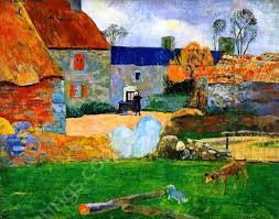

                             Paul Gauguin's "The Blue Roof"


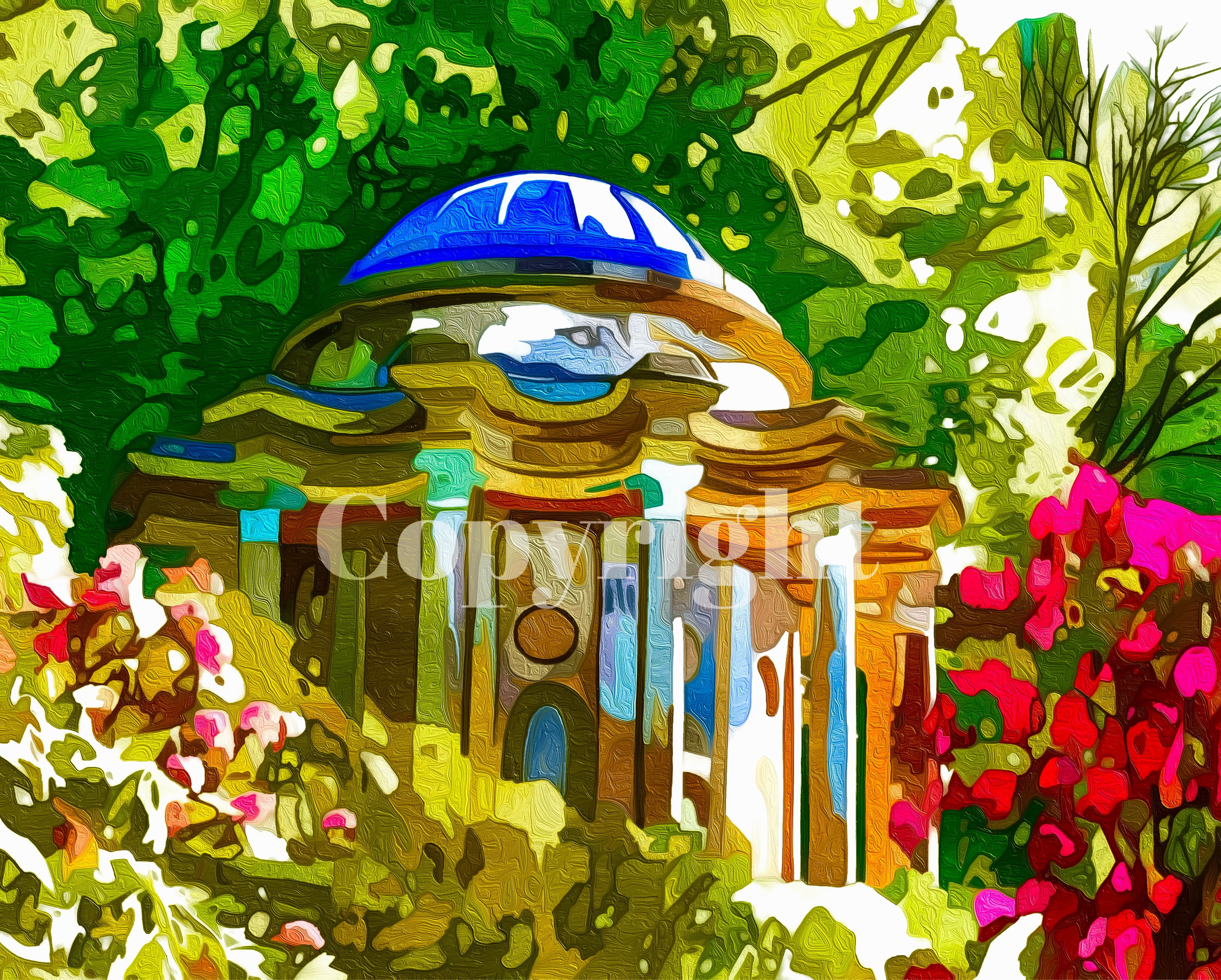
Hence we, as visual artists, do exactly the same. We use colour to elicit the mood of our art. AND,  a simple 'pop' of colour in a painting can transform it entirely. In addition, using specific colours at distinctive points in our paintings can structurally transform the whole image. In Paul Gauguin's "The Blue Roof" or "Farm At Le Pouldu", (above) the striking blue roof acts as an anchor turning a traditional countryside landscape into a modern tapestry-like composition. The blue roof on 'The Temple Of Apollo' (Stourhead NT) does much the same.


In today's fast-paced and sometimes stressful world, incorporating colour into our daily lives can provide a much-needed sense of calm and happiness. Whether through the clothes we wear,  the songs we listen to, or the scenes we paint, embracing the benefits of colour can have a powerful and positive impact on our overall well-being. Hence, here at 'The Little Gallery Of Much Colour' we won't just, 'Paint It Black'!
14Feb

Given that today is Valentine’s Day, one might expect that my thoughts would be firmly fixed on the traditional palette of reds and pinks. However, having spent much of my early adult life teaching science, I have long been more intrigued by the psychological and physiological effects of colour than by its purely romantic associations. The way different hues can subtly alter our emotions, behaviour, and even our sense of time and space has always held a particular fascination for me. Not long ago, I revisited a 2022 article on the BBC website that explored the relationship between colour and mood in greater depth, and one example featuring the colour pink stood out. The article discussed an experimental trial conducted in a prison in the United States, where certain cells were painted a soft, delicate shade of pink. Observations over time indicated a notable decrease in aggressive incidents and violent behaviour among the occupants of these cells. While the mechanisms are still the subject of ongoing research and debate, the findings suggested that something as seemingly simple as a change in wall colour could contribute to a calmer, less confrontational environment. 


Have a read here: https://www.bbc.co.uk/future/article/20220713-the-hidden-meaning-of-your-favourite-colour

Whatever you chose to believe about the links between concentration, mood and thinking, the colours an artist chooses for a painting will carry significant meaning, acting as a powerful, non-verbal language that influences emotions, conveys themes, and shapes a viewer’s experience.


Look at the elephants. Do they make you feel romantic, or caring, or even jealous? Somehow the pastel colours will have an effect on your mood.


28Oct

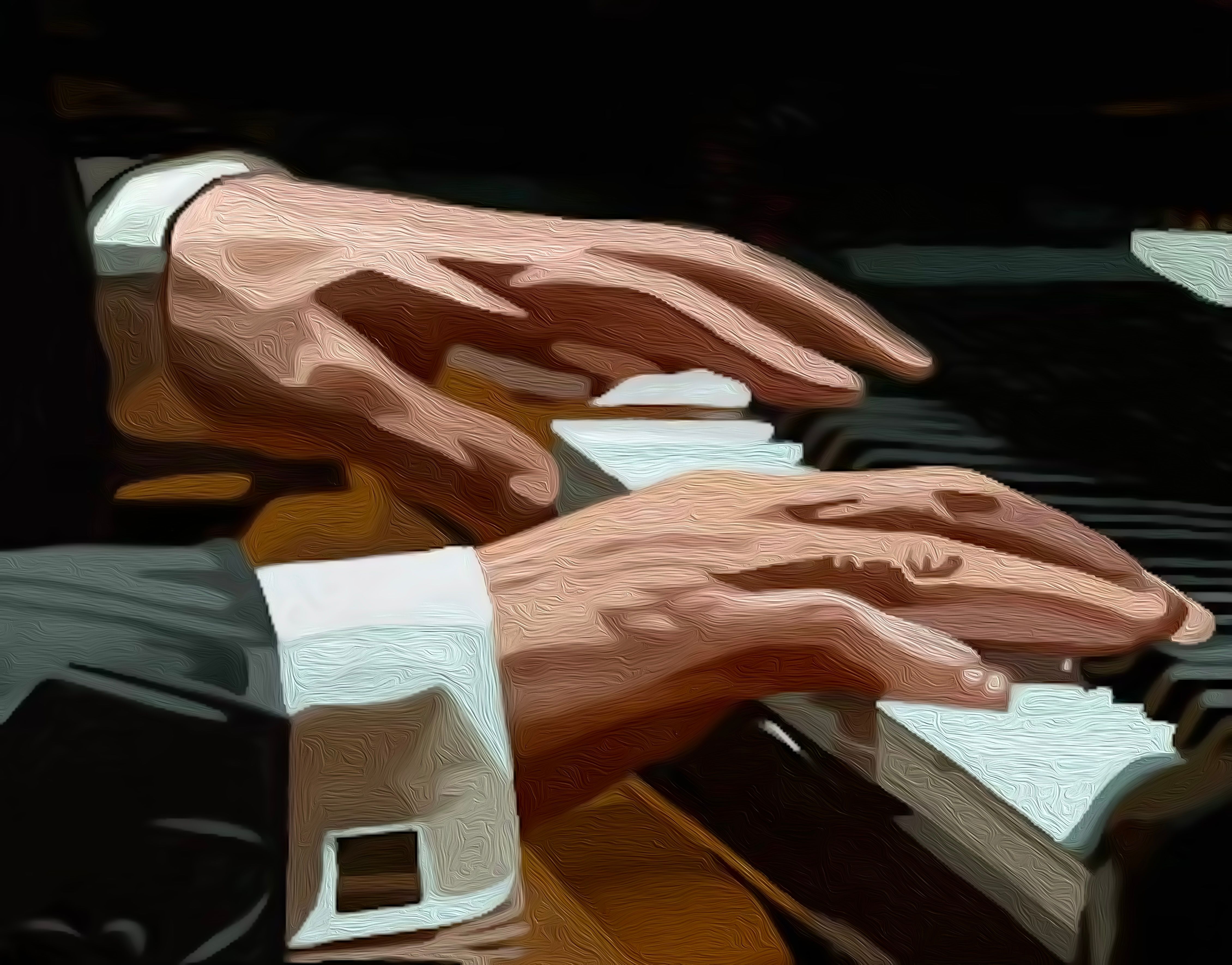
We are frequently tempted to use lots of colour where it isn't needed in our artwork and when experience should tell us that often 'less is more'. Take this piece for example.  The composition focuses on the expressive movement of a pianist’s hands poised above the keys, rendered with a unique blend of traditional and digital techniques. The textured, swirling brushwork creates a sense of rhythm and motion, echoing the dynamic energy of a live performance.The artist’s attention to anatomical detail and the subtle interplay of light and shadow lend the hands a sculptural quality, while the crisp white cuffs and formal attire add a touch of sophistication. The monochromatic palette, accented by warm skin tones and the gleam of the piano keys, beautifully captures the setting and moment. Anyone who appreciates the intersection of art and sound, will recognise that this artwork with its restrained colour palette, could easily bring the elegance and passion of live music into your environment—where colour matters, and creativity meets innovation.

'Piano Fingers' - The Art Of A Maestro

27Aug


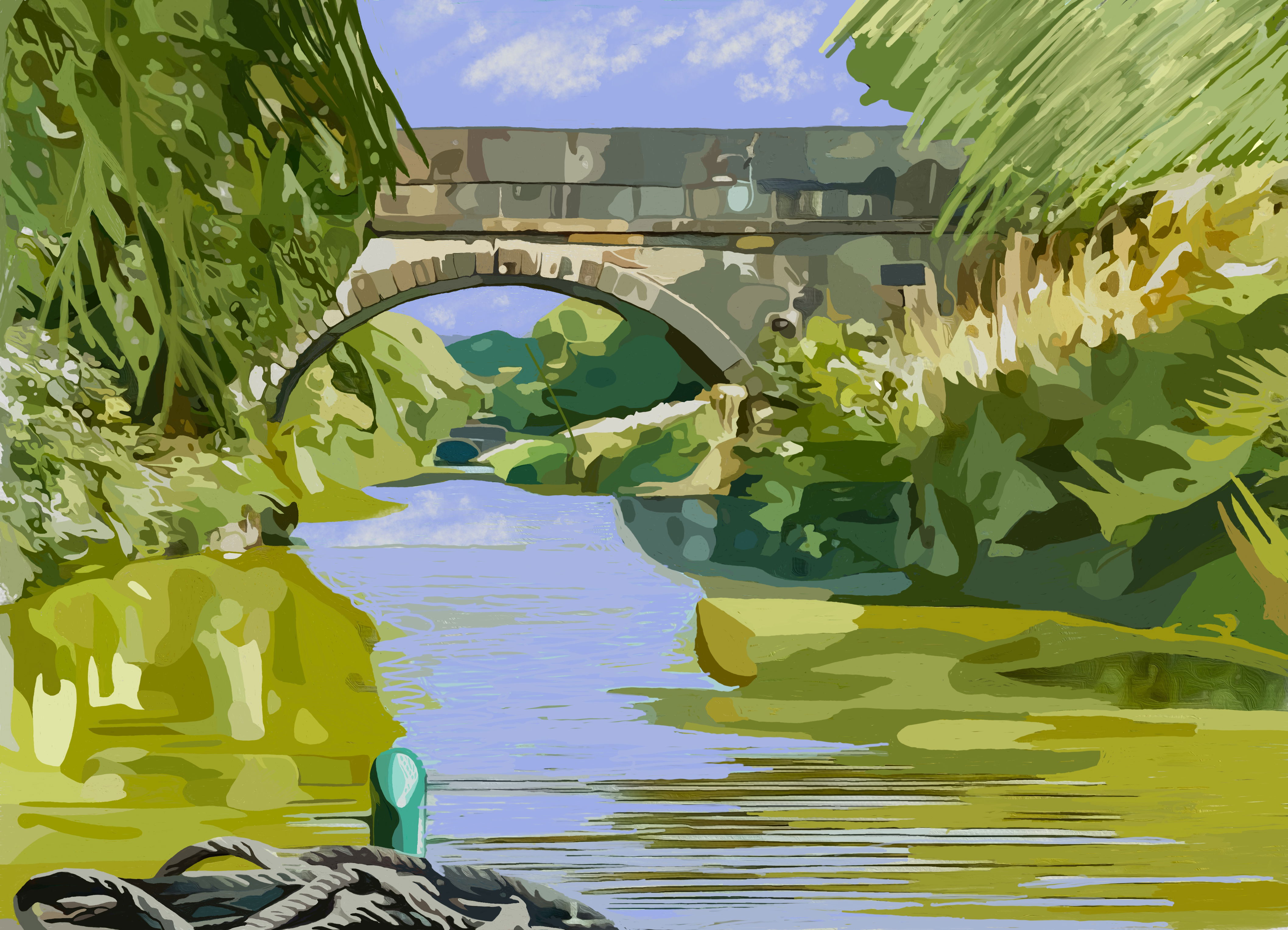
The Art Of A Waterway 

This artwork presents a serene landscape, attempting to capture the tranquil essence of a waterway framed by lush greenery. Each small segment is a testament to the importance of colour in our perception of nature, embodying the philosophy of "Where Colour Matters." The soft hues of the water contrast beautifully with the rich tones of the foliage. The arching bridge, a focal point of the composition, invites contemplation and connection with nature. The interplay of light and colour reflects our commitment to blending traditional artistry with modern techniques, creating a vivid portrayal of the British countryside.


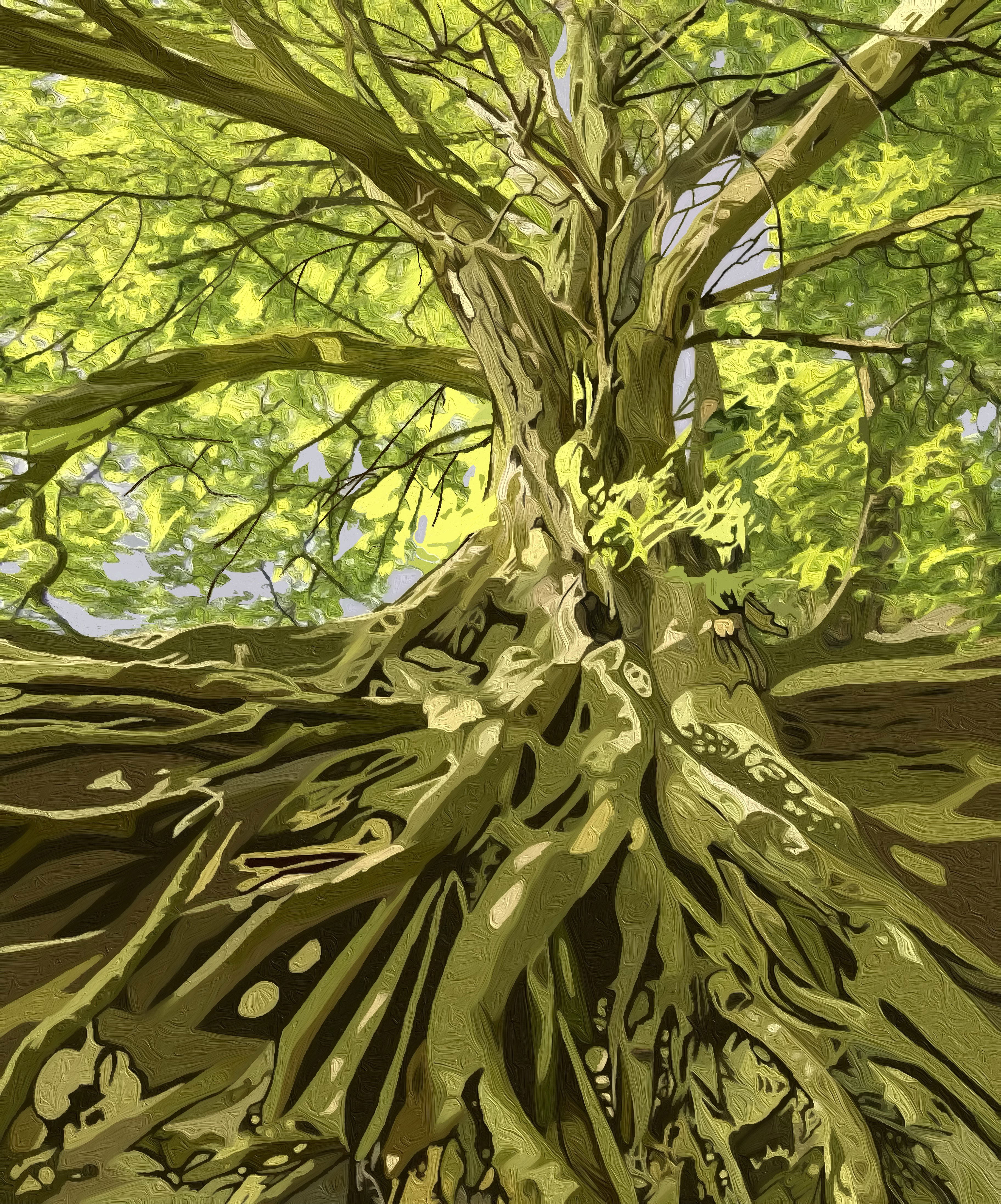
The Art Of Roots And Growth

This artwork presents a magical view of a majestic tree, its intricate roots sprawling across the ground, embodying the strength and resilience of nature. The vibrant green and yellow leaves filter sunlight, creating a luminous canopy that contrasts beautifully with the textured bark and earthy tones below. The organic forms and dynamic lines invite contemplation, revealing the interconnectedness of life. It reminds us that, in the heart of our vibrant landscapes where nature thrives, we can find inspiration in the intricate details of life.


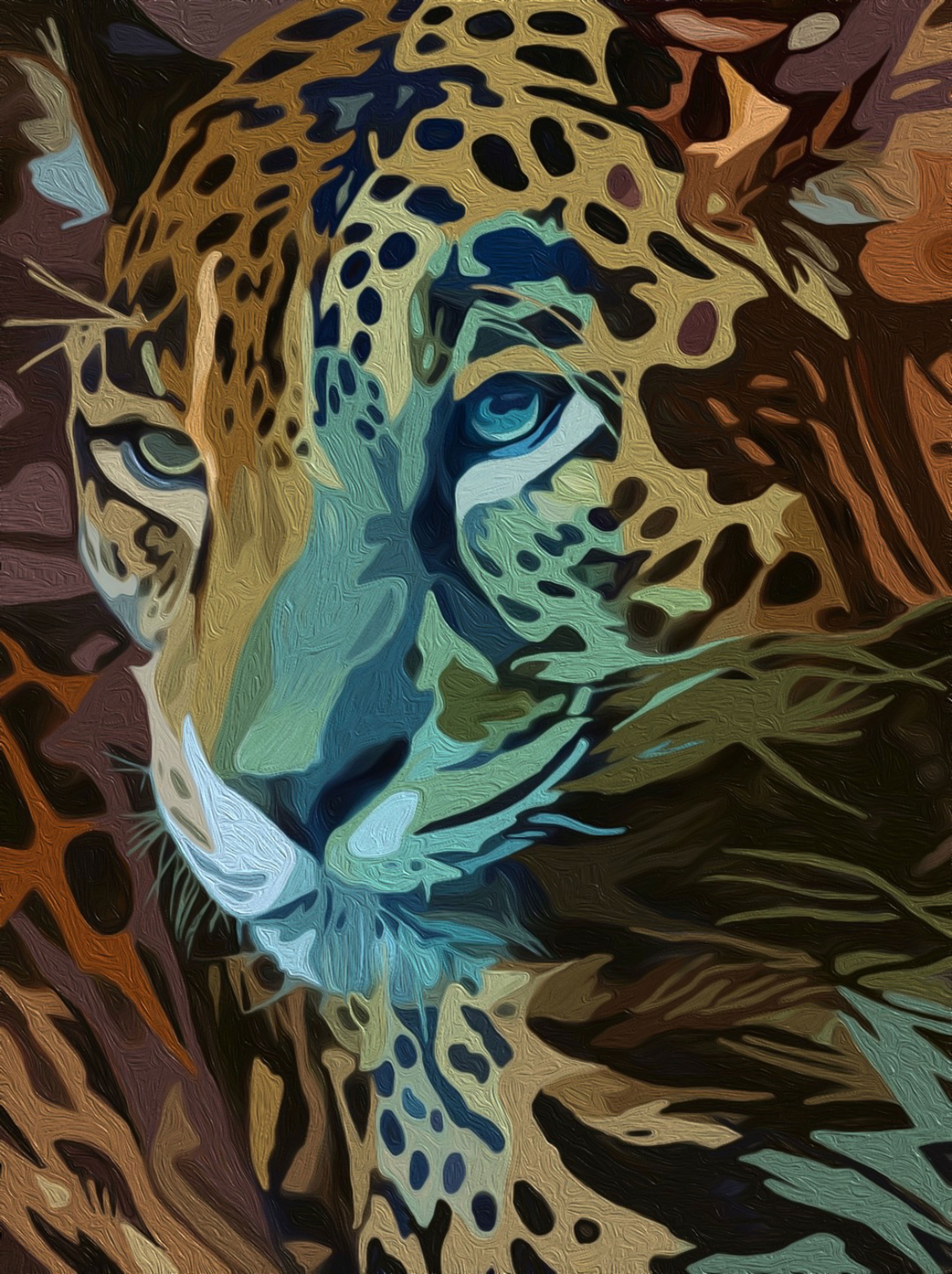
The Art Of The Leopard

This colourful portrayal of wildlife tries to showcase the intricate beauty of the leopard's coat through a blend of traditional and digital techniques. The leopard’s face, rendered in a blend of golden yellows, deep browns, and bold black spots, aims to immediately draw you in. The   interplay of colour and texture, create the essence of this majestic creature.